

Ask an AI assistant for an architecture diagram and you'll almost always get the same thing back: rounded boxes, a default blue, drop shadows, and Comic Sans energy dressed up as a flowchart. It's recognizable on sight — "Mermaid-slop," as one developer put it — and it looks nothing like the site or deck it's supposed to live in. Diagram Design, an open-source Agent Skill built by Cathryn Lavery, is a direct answer to that problem: 27 diagram types, editorial quality, rendered in whatever colors and fonts your own website already uses — extracted automatically, in about 60 seconds, the first time you use it in a new project.
It's a useful case study for two separate reasons. First, on its own terms, it's a well-built tool for a genuinely annoying gap in AI-assisted work — the twenty minutes everyone has lost fighting Figma for a diagram that should have taken thirty seconds. Second, it's one of the clearer real-world demonstrations of what the Agent Skills format is actually good for, past the abstract pitch: a large, structured body of design knowledge that only loads into context when it's needed.
What It Actually Produces
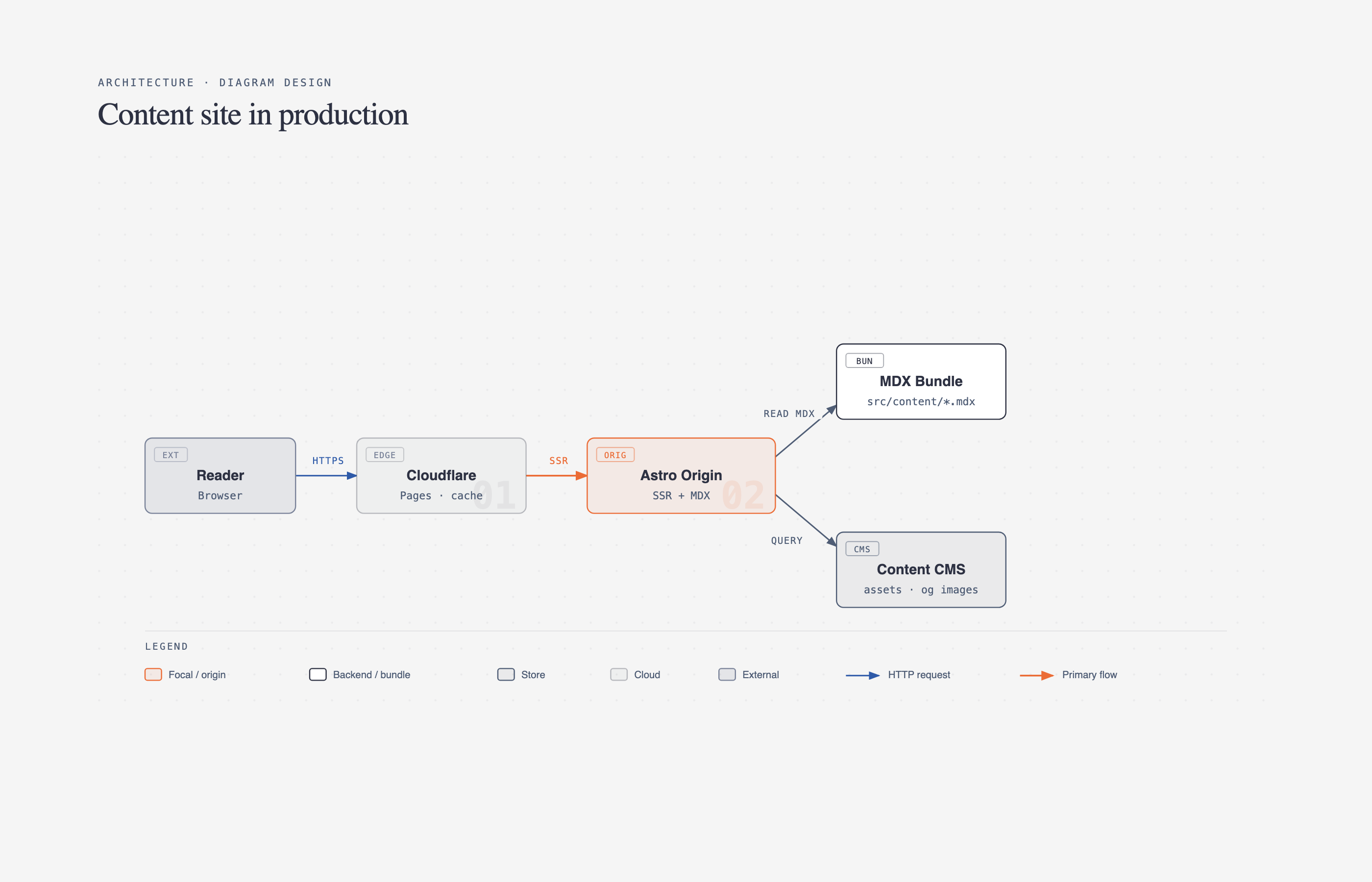
Diagram Design ships 27 diagram types — architecture, flowchart, sequence, state machine, ER/data model, timeline, swimlane, quadrant, nested hierarchy, tree, org chart, layer stack, Venn, pyramid/funnel, radar, loop/flywheel, Gantt, bar/line/scatter charts, and several more specialized ones for IT modernization and data-platform diagrams. Every type renders in three variants — minimal light, minimal dark, and a fuller "editorial" layout with summary cards — as self-contained HTML and SVG. No build step, no JavaScript framework, no external image dependencies. You open the file in a browser and it's done.
That output format is a quieter design decision than it looks. A diagram that's just an SVG wrapped in HTML is trivially portable — it drops into a static site, an email, a slide, or a design tool without a rendering pipeline. Compare that to a Mermaid diagram, which needs a Mermaid-aware renderer wherever it ends up, or a Figma file, which needs Figma. The tradeoff is that Diagram Design doesn't give you a live, editable canvas the way Figma does — you're editing structured HTML/SVG, or re-prompting Claude, not dragging shapes around. For final polish on a hero graphic that's fine to hand off to a designer; for the fast, disposable diagrams that make up most technical writing, it's the right end of that tradeoff.
The Design System, in Practice
The README states the underlying philosophy in one line: "the highest-quality move is usually deletion." Every diagram targets a density score of 4 out of 10, one accent color is reserved for the one or two things a reader should actually notice first, and — the detail that does the most invisible work — every coordinate, width, and gap is divisible by 4. That last rule sounds fussy until you've seen enough AI-generated layouts with elements two pixels off from an implied grid; that jitter is a large part of what makes generated diagrams read as generated. Enforcing a hard 4px grid is a cheap, mechanical fix for a problem that's usually treated as a fuzzy aesthetic judgment.
Typography is fixed to three families with defined jobs, not left to the model's discretion per diagram: Instrument Serif for titles and italic editorial callouts, Geist Sans for node labels, Geist Mono reserved specifically for technical content — ports, URLs, field types — rather than used as a blanket "developer" look. Borders are 1px hairlines, shadows are banned outright, and border-radius tops out at 10px. None of this is groundbreaking as a design system on its own; what's notable is that it's specified precisely enough for an LLM to follow consistently across 27 different diagram types without drifting back toward defaults.

Reading Your Brand Automatically
The part that separates this from a static template library is the onboarding flow. Point it at a URL — "onboard diagram-design to https://yoursite.com" — and it fetches the homepage, extracts the dominant palette and font stack, and maps what it finds to semantic roles rather than raw hex codes:
| Detected from your site | Becomes |
|---|---|
<body> background | paper token |
| Primary text color | ink token |
| Secondary/caption text | muted token |
| Most-used brand color (CTA, link, heading) | accent token |
<h1> font family | title font |
<body> font family | node-name font |
Before writing anything, it runs a WCAG AA contrast check on ink-over-paper — if a site's actual brand color would fail at the 9-12px text sizes diagrams use, it proposes an adjusted value and explains why, rather than silently shipping unreadable labels. Every downstream diagram, the annotation primitive, and the gallery all reference these values by semantic name — accent, never a literal #eb6c36 — so a rebrand is a one-file edit in style-guide.md, not a search-and-replace across dozens of generated files.

There's also a first-run gate: on a new project where the style guide is still at its jet-black-and-tangerine default, the skill pauses before generating anything and asks whether you want to onboard, paste tokens manually, or proceed with the default look. That's a small but deliberate choice — it stops a team from accidentally shipping fifteen off-brand diagrams before anyone notices the skill never got pointed at their actual site.
How the Skill Itself Is Structured
This is the part worth studying if you're building or evaluating Agent Skills generally, not just diagrams. SKILL.md — the file Claude always has in context once the skill is active — stays deliberately thin: philosophy, a selection guide for picking the right diagram type, and a checklist. The 27 type specs, the icon set, the sketchy and terminal-window rendering primitives, the export procedure, and the onboarding spec all live in separate files under references/ and only get loaded when the specific request calls for them.
The repo's own table makes the pattern concrete:
| You ask for… | Claude loads |
|---|---|
| "Make me a flowchart" | SKILL.md + type-flowchart.md |
| "Onboard this skill to my site" | SKILL.md + onboarding.md + style-guide.md |
| "Give me a hand-drawn version" | SKILL.md + primitive-sketchy.md |
That's progressive disclosure doing real work: the skill ships 34 reference files total, but a routine request only ever pulls in SKILL.md plus the one file it actually needs. It's the same mechanism explained more abstractly in what Agent Skills are — here it's the difference between a skill that stays fast at 34 files and one that would choke a context window trying to hold all of them at once. Adding a 28th diagram type tomorrow means dropping in one new type-*.md file and a line in the selection guide; nothing else in the skill changes.

Benefits of the Diagram Design Skill
The design rules, brand onboarding, and skill structure add up to a handful of practical gains for anyone producing diagrams regularly.
Diagrams that look like they belong
The most visible benefit is that output matches the surrounding site or document. Colors come from your own brand tokens, typography follows fixed roles, and the hairline, no-shadow style avoids the generic look that marks most AI-generated diagrams. Readers stop noticing the diagram as a foreign object and start reading it, which is the whole point of including one in the first place. Across a site with dozens of diagrams, that consistency also makes the content as a whole feel more deliberate.
Minutes instead of a design-tool session
Describing a sequence diagram in a sentence and getting a finished file back replaces the familiar twenty-minute fight with a design tool for something that should have been quick. For technical writing, where diagrams are often disposable and revised alongside the text, that speed changes whether people bother to include a diagram at all.
Output that drops in anywhere
Self-contained HTML and SVG need no renderer, build step, or framework. The same file works in a static site, a docs repo, an email, or a slide. Compared with formats that need a specific renderer wherever they end up, this removes a whole category of "why doesn't the diagram show up here" problems.
Rebrands and accessibility handled centrally
Because every diagram references semantic tokens rather than literal hex values, changing the accent color is a one-file edit in the style guide. The onboarding contrast check also catches brand colors that would be unreadable at small label sizes before any diagram ships. Consistency and legibility become properties of the system rather than of each individual diagram.
A reusable pattern for building skills
For teams building their own Agent Skills, the repo is a working example of progressive disclosure: a thin SKILL.md, many reference files loaded only on demand, and a lint script to enforce the rules. Studying it shortens the path to well-structured internal skills for other domains, whether that's a house style for reports, a code review checklist, or a set of templates for customer documents.
Diagram Design Use Cases
The skill fits wherever diagrams are frequent, need to match a brand, and don't justify a designer's time individually.
Technical blog posts and documentation
Engineering blogs and docs sites lean heavily on architecture diagrams, flows, and sequence charts. Writers working in Claude Code can generate a diagram in the same session as the text, styled to the site, and revise both together. The outcome is more posts with useful diagrams, and fewer that either skip them or embed something visibly off-brand.
Architecture reviews and design documents
Design docs and architecture decision records need clear diagrams of current and proposed systems, often several versions as the discussion evolves. Generating them from a description makes iteration cheap: change the description, regenerate, compare. Reviewers get consistent, readable visuals rather than whiteboard photos or mismatched tool exports, and the diagram source can live next to the document it illustrates.
Internal onboarding and runbooks
Onboarding guides and runbooks benefit from org charts, swimlanes, and process flows, but rarely get design attention. The skill lets the engineers who own these documents produce clean diagrams themselves, styled to internal standards. New team members get material that's easier to follow, and maintainers can update diagrams when processes change instead of leaving stale images in place. Keeping diagrams current is often the difference between a runbook people trust and one they ignore.
Content marketing and explainers
Marketing teams producing explainers, comparison posts, or product walkthroughs need diagrams that match brand guidelines. After onboarding against the company site, the skill produces timelines, funnels, and layer stacks in house colors and fonts. The result is consistent visuals across a high volume of content, with a designer reserved for hero graphics.
Slides and client deliverables
Consultants and agencies preparing decks or reports can export diagrams as SVG or PNG for slides, matching a client's brand by onboarding against the client's site. That saves rebuilding diagrams in each client's template by hand, and keeps every exhibit in a deliverable visually consistent. Because the style guide is a single file, switching between clients is a matter of keeping one token set per client rather than re-styling diagrams one at a time.
Installing and Extending It
The repo is MIT-licensed and works three ways: symlink the inner skills/diagram-design/ folder into ~/.claude/skills/ for a version you can hand-edit and keep in sync with git pull; install it as a Claude Code plugin via /plugin marketplace add cathrynlavery/diagram-design for a faster setup that won't survive local edits to the style guide across plugin updates; or add it to Codex with npx skills add. The same directory tree works across all three, which is itself a small demonstration of the portability argument for the SKILL.md format — one folder, multiple agent harnesses.
Finished diagrams export to SVG or PNG via a slash command (/diagram-design:export), with PNG rasterized through Playwright at 2x scale by default. There's also a lint-skin.py script contributors run against new example diagrams to keep the design system's rules — the 4px grid, the token usage, the density target — enforced mechanically rather than by eyeballing pull requests.
Where It Falls Short
The README is unusually direct about its own boundaries, which is worth taking at face value rather than reading as false modesty. It explicitly lists cases where you shouldn't use it: a single labeled box, a before/after comparison that's really just a table, a list dressed up as a diagram. Its own litmus test — "would a reader learn more from this than from a well-written paragraph?" — is a useful check to borrow even outside this specific tool.
Practically, a few limits matter for evaluation:
- It needs an agent harness that supports Agent Skills. This isn't a standalone app — it only does anything inside Claude Code, Claude Cowork, or Codex with the skill installed.
- PNG export needs a one-time local setup (
pip install playwright && playwright install chromium), which is a small but real dependency to add to a writing workflow that's otherwise dependency-free. - The editorial "-full" variant isn't exported. SVG/PNG export is diagram-only; the summary cards and headers in the fuller editorial layout require a browser screenshot instead.
- Brand extraction is a starting point, not a guarantee. It reads what's actually on the page — a site with inconsistent color usage or no clear accent color will need manual token adjustment after onboarding, same as any automated brand-extraction tool.
Common Diagram Design Mistakes
The limits above are properties of the tool. These are the mistakes users make with it, most of which undo the consistency it's designed to provide.
Skipping or rushing onboarding
The first-run gate exists for a reason, but it's easy to choose "proceed with default" to get a diagram out quickly and never come back. The result is a batch of diagrams in the default jet-black-and-tangerine palette scattered across a site that looks nothing like it. Onboarding takes about a minute; doing it before the first real diagram avoids redoing a dozen later.
Diagramming what should be a paragraph or table
Because diagrams become cheap, it's tempting to add one everywhere. A single labelled box, a list dressed up as a flow, or a before-and-after that's really a two-column table adds visual noise without teaching anything. The tool's own test, whether a reader would learn more from the diagram than from a well-written paragraph, is the check most often skipped.
Trusting the content because the style is good
Polished visuals make diagrams look authoritative. The skill controls style, not accuracy: if the description of the system was wrong or the model filled gaps with assumptions, the diagram will be wrong in a very convincing way. Every generated diagram needs the same factual review as AI-written text, especially arrows, labels, and the order of steps.
Hard-coding colors in edits
When hand-editing a generated file, it's quick to paste a hex value instead of using the semantic token. Each literal color breaks the one-file rebrand and drifts from the system. Over time those edits accumulate into exactly the inconsistency the skill was meant to prevent.
Choosing the wrong install method for customisation
The plugin install is faster, but local edits to the style guide may not survive plugin updates. Teams that customise tokens or add diagram types after installing as a plugin can lose that work. If you plan to edit the skill, the symlinked install that you keep in sync with git pull is the safer choice.
Diagram Design Best Practices
These practices keep the skill producing consistent, accurate diagrams as usage spreads across a team.
- Onboard before the first real diagram. Point the skill at your site, review the extracted tokens and any contrast adjustments it proposes, and fix inconsistent brand colors manually before generating anything you plan to publish.
- Keep the style guide in version control. Treat
style-guide.mdlike any shared config: commit it, review changes, and make it the single place brand decisions live. That way the whole team generates from the same tokens and changes are traceable. - Apply the paragraph test every time. Before generating, ask whether the diagram teaches more than a clear paragraph or table would. Fewer, better diagrams serve readers more than a diagram in every section.
- Describe structure precisely. Name components, relationships, and step order explicitly in your prompt rather than leaving the model to infer them. Precise descriptions produce accurate diagrams and reduce correction rounds.
- Review content, not just looks. Check every label, arrow, and step against the real system or process before publishing, and have someone who knows the system glance at architecture diagrams.
- Prefer SVG for the web. Use SVG export for sites and docs to stay sharp at any size and keep files small; reserve PNG for slides or tools that need raster images.
- Lint custom additions. If you add diagram types or examples, run the repo's lint script so the grid, token usage, and density rules stay enforced mechanically.
- Pick one install method per team. Agree whether the team uses the symlinked install or the plugin, based on whether you'll customise the skill, so everyone generates from the same version and style guide.
- Regenerate rather than hand-patch. When a system changes, update the description and regenerate the diagram instead of editing coordinates by hand. It keeps the 4px grid and token usage intact and makes the diagram easy to update again next time.
Why This Is Worth Watching
Most of the AI tooling conversation around design and diagrams has been about generation quality in the abstract — can the model draw a good box. Diagram Design is evidence that the more tractable problem, for a lot of real work, is constraint: a tightly specified design system plus a brand-extraction step plus a deliberate gate against off-brand output solves "this doesn't look like slop" more reliably than a better prompt would. That's the same lesson showing up elsewhere in spec-driven development and in how teams are learning to scope vibe coding — the win usually comes from tighter specification, not a smarter model call. It's also a clean example of the open-source skill ecosystem that's forming around agent harnesses: a folder on GitHub, MIT-licensed, that adds a real capability to whichever agent you already run, no vendor lock-in required.
For teams doing a lot of technical writing, internal documentation, or content marketing that leans on architecture diagrams and process flows, it's a reasonable default to try before reaching for Figma or accepting whatever an assistant draws unprompted — and worth reviewing the same way you'd review any AI-generated output entering a real workflow: check the contrast, check the brand match, and apply the tool's own "would a paragraph be better" test before publishing.
Teams building AI-assisted documentation, internal tooling, or content workflows around Claude Code and Agent Skills can get hands-on architecture and integration help from Woyce Technologies.
FAQ
What is Diagram Design?
Diagram Design is an open-source Agent Skill for Claude Code (and compatible harnesses like Codex) that generates 27 types of editorial diagrams — architecture, flowcharts, sequence diagrams, org charts, and more — as self-contained HTML and SVG files styled to match a project's own brand colors and fonts. It was built by Cathryn Lavery and is published on GitHub under the MIT license. Each diagram type comes in minimal light, minimal dark, and a fuller editorial variant, and the output has no build step or framework dependency, so files open directly in a browser or drop into a site.
How does it match my brand automatically?
You ask it to onboard against your site's URL. It fetches the homepage, extracts the dominant background, text, and accent colors along with the heading and body font families, checks the result against WCAG AA contrast standards, and writes the values into a style guide file that every diagram then references. Colors are stored as semantic tokens such as paper, ink, muted, and accent rather than raw hex codes, so a rebrand means editing one file. If the extracted brand color fails contrast at small label sizes, the skill proposes an adjusted value and explains why.
Do I need Figma or design skills to use it?
No. Diagrams are described in natural language ("make me a sequence diagram of an OAuth refresh flow") and Claude Code generates the HTML/SVG file directly — no design tool or manual drawing required. The design decisions, including spacing, typography, and accent usage, are already encoded in the skill. You still need a sense of what the diagram should communicate, and it's worth reviewing the result for accuracy and clarity before publishing, the same as any AI-generated content.
Can I export the diagrams as images?
Yes — a slash command exports diagrams to SVG directly or to PNG via Playwright at 2x resolution by default. The fuller "editorial" layout with summary cards isn't included in the export and needs a browser screenshot instead. PNG export depends on a one-time local Playwright and Chromium install, while SVG export works without it. SVG is usually the better choice for websites and documentation because it stays sharp at any size and keeps the file small.
Is Diagram Design free to use?
Yes, it's MIT-licensed and available on GitHub — installable by symlinking the skill folder, as a Claude Code plugin, or via Codex's skill installer. There's no paid tier described in the repo. The practical costs are the agent harness you run it in, such as a Claude Code subscription or API usage, and a little setup time. Because it's MIT-licensed, teams can also fork it and adapt the style guide or diagram types to internal standards.
What's the difference between this and asking Claude for a diagram directly without the skill?
Without a skill, an agent falls back to generic defaults — rounded boxes, default colors, no consistent grid or typography rules. The skill supplies a fixed design system (spacing grid, font roles, accent-color discipline) and 27 pre-specified diagram types, which is what produces consistent, on-brand output instead of a different look every time.
Who should use Diagram Design?
It suits teams that produce a steady flow of technical documentation, architecture write-ups, blog posts, or internal explainers and already work inside Claude Code or Codex. Developer advocates, technical writers, and engineering leads who need clear diagrams quickly will get the most from it. It's less useful for one-off hero graphics that need a designer's hand, or for teams that don't use an agent harness supporting Agent Skills.
How do I get started with Diagram Design?
Install the skill by symlinking its folder into your Claude Code skills directory, adding it as a Claude Code plugin, or using Codex's skill installer. Then onboard it against your website URL so it extracts your colors and fonts, and check the proposed tokens. After that, describe the diagram you want in plain language and review the generated HTML or SVG before exporting.
Conclusion
The problem Diagram Design tackles is familiar to anyone who writes technical content with AI: generated diagrams that all look the same and match nothing else on the page. Fixing that by hand in a design tool takes far longer than the diagram deserves.
The skill's answer is constraint rather than cleverness. A tight design system with a 4px grid, fixed font roles, and a single accent color, combined with automatic brand extraction and a gate against off-brand defaults, produces consistent output across 27 diagram types. Its structure is also a good model for Agent Skills in general: a thin SKILL.md that pulls in only the reference file a request needs.
It has limits worth weighing. It only runs inside agent harnesses that support skills, PNG export needs a local Playwright setup, the editorial variant can't be exported directly, and brand extraction needs a human check on sites with inconsistent styling. Its own rule of thumb, asking whether a paragraph would teach more than the diagram, is worth applying every time.
If your team writes a lot of documentation, try it on the next architecture write-up and compare the time spent with your current approach. For help building skills and agent workflows around your own tools, our AI agent development team can help you design and ship them.